The deciding factors in whether or not someone listens to your podcast can be split into two groups – the content and the packaging.
Your podcast cover image/cover art is one key part of your podcast’s packaging that makes a huge impact on whether someone clicks your show or keeps scrolling.
People DO judge books by their covers, and your podcast cover art is that cover. You’re inviting potential listeners to check it out among thousands of other podcasts.
Let’s explore how to make a podcast cover image (cover art) and why it’s such an important part of your podcast’s success.
What is Podcast Cover Art?
Imagine strolling through a virtual library of podcasts – cover art serves as the book cover, inviting you to explore its contents. It’s the visual representation that accompanies your podcast on the podcast apps like Apple Podcasts or Spotify.
This thumbnail-sized image is the doorway to your world. It’s often the first thing potential listeners notice, along with the title, before deciding whether to click and explore further.
What Is A Podcast Logo?
Just to clear things up, your cover art is not a ‘logo’.
A logo is a distinct symbol, design, or wordmark that represents your podcast’s brand in a simple and recognisable way.
While your podcast cover art is a full visual display meant to grab attention and introduce your show, your logo is more streamlined—like a signature or stamp that people associate with your brand across different platforms, like on your website.
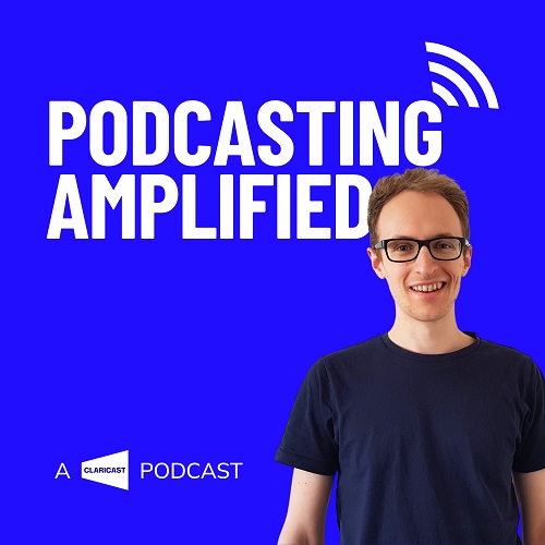
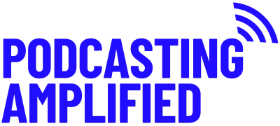
Your logo is a key part of your branding, and your logo will probably be the main part of your cover art, but they’re two different things. Check out the examples below.


What Should My Podcast Cover Art Look Like?
Your cover art should be three things. Let’s call them the 3 Cover Art ‘Cs’ –
- Clear
It should be easy to read the title of your podcast at very small sizes so potential listeners know what they’re clicking and remember the name of your show.
It should give an indication to the general feel and topic of the show, too. Graphics and images can be incorporated so long as they don’t distract from the name. In terms of text, little else (if anything) should be present on your cover art aside from the show name.
- Captivating
It should be visually striking and distinctive – something that catches the eye amidst your competitors. This will require some research into what competing cover art within your niche looks like.
- Cohesive
Your cover art should fit with the wider podcast (or business) brand. Incorporate brand colours and fonts.
Your goal is to make it instantly recognisable, memorable, and reflective of your podcast’s theme or content.
How to Make a Podcast Cover Image
Outsourcing
Ideally, you would outsource your cover art creation to a professional graphic designer or podcast agency. Unless you’re a graphic design wiz yourself.
You can provide them with a design brief. The brief should include your podcast’s title, theme, ideal listener, brand guidelines and examples of cover art you like. With this brief they’ll be able to create a cover that resonates with ideal listener and fits with your brand.
Do It Yourself
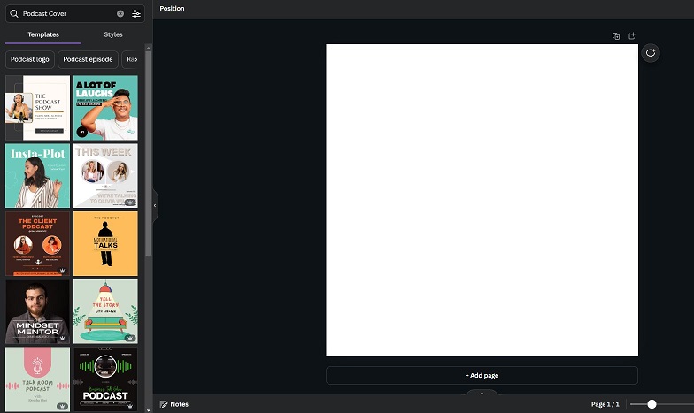
If you don’t have the budget to outsource, platforms like Canva offer user-friendly tools to create your own.
Your cover art must follow these technical specifications to ensure that it’s compatible with the podcast platforms –
- A square aspect ratio with a size between 1400 x 1400 pixels and 3000 x 3000 pixels.
- RGB colour space (most programs, like Canva, will be in RGB by default).
- 72dpi minimum.
- PNG or JPG file format.
- Some podcast hosts may have a limit to filesize too. JPGs are smaller than PNGs, so if your image file is too large, use JPG.
It’s then simply a case of deciding what you want your cover art to look like. Browse similar podcasts for inspiration, but make sure yours stands out. Canva (and other, similar apps) includes podcast cover image templates. You can use these for inspiration, too, just be sure to make them your own.

Once you have the correct settings for your new project, it’s time to get designing. Here are some more pointers to keep in mind –
Font
Start with a bold, legible font for the title/logo—one that stays clear even at small sizes. If you’re including a subtitle and want to use a second font, ensure it’s also legible, goes with the first font, and you stick to these one or two fonts across all of your podcast branding.
Colours
Stick to a minimal color palette (two to three complimentary colours) that fits your podcast’s theme.
Graphics
If you include images or illustrations, keep them simple and relevant to your content. Avoid clutter and make sure the design has breathing room so it doesn’t look too busy. Ultimately, the goal is to create something that grabs attention instantly, conveys your podcast’s message, and stays memorable even with a quick glance.
The Power of Your Cover Art
We hope this has given you some clarity on how to make a podcast cover image. It’s not just a picture; it’s your podcast brand’s ambassador in the digital space.
Crafting a captivating cover art that resonates with your ideal listner can significantly impact your audience’s first impression and draw them into exploring your podcast further.


